DATA SCIENCE:
Data Science
Decode the data!
Be the trailblazer of every data-driven decision.
WE'RE DIFFERENT.
SO ARE YOU.
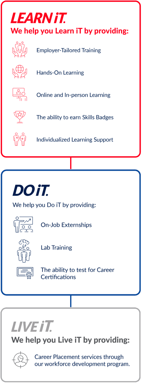
OURDIFFERENCE
OURDIFFERENCE
* SCI does not guarantee employment or a starting salary upon graduation, completion, or withdrawal from SCI.
CAREER TRAINING.FOR YOUR FUTURE.
- Southern Careers Institute
- Competitors
| Southern Careers Institute | Competitors | |
$3999 /year | $3999 /year | |
| 380 HOURS OF HANDS-ON LAB WORK | ||
| A GROUP PORTFOLIO PROJECT | ||
| STATISTICAL PROGRAM TRAINING | ||
| DATA WRANGLING AND VISUALIZATION TRAINING | ||
| MACHINE LEARNING AND MODELING TRAINING | ||
| PROGRAMMING FOUNDATIONS TRAINING | ||
| EARN 10 CAREER SKILL BADGES | Buy Now | Buy Now |
The graphic compares our institution’s features and benefits to competitors who offered the program between 01/01/2024 and 06/31/2024 in Texas. It is essential to conduct independent research when choosing an institution for training. Information in the graphic is general and may vary. We do not guarantee accuracy and disclaim liability.
WHAT TO KNOW ABOUT ADATA SCIENCE CAREER
Why would you want to be a Data Scientist?
Data science is a rapidly growing field that offers numerous opportunities for career advancement and financial stability. It’s an exciting field that involves working with large amounts of data to extract valuable insights and make data-driven decisions. Additionally, data science is a field that is in high demand, and there is a shortage of skilled professionals, which means there are numerous job opportunities available for data scientists.
What is a Data Scientist?
A data scientist is a professional who is skilled in analyzing large amounts of data using statistical analysis, machine learning, and other analytical techniques. They use data to identify patterns and make predictions, and then communicate those findings to stakeholders. Data scientists work with data from various sources, such as social media, customer behavior, sales, and other data sources.
Where can a Data Scientist work?
Data scientists can work in various industries, including healthcare, finance, retail, e-commerce, and technology. They can work in large corporations, startups, government agencies, and research institutions.
What skills do you need to be a Data Scientist?
Data scientists require a combination of technical and soft skills to be successful. Technical skills include knowledge of programming languages like Python and R, statistical analysis, machine learning, data mining, and database management. Soft skills include critical thinking, problem-solving, communication, and project management.
Do you need any certifications to become a Data Scientist?
While certifications are not always necessary, they can be a valuable asset in demonstrating your skills and knowledge in data science. Many organizations offer certifications in specific areas of data science, such as machine learning, data engineering, or data visualization.
Do you need training to become a Data Scientist?
While it’s possible to become a data scientist without formal training, having a degree or certification in data science can be beneficial in developing the necessary skills and knowledge to succeed in the field. Additionally, many employers prefer candidates with a degree or certification in data science, as it demonstrates their commitment to the field and their ability to work with complex data.
Southern Careers Institute (SCI) does not guarantee employment or a starting salary upon graduation, completion, or withdrawal from SCI. It is not required to attend SCI to attain a job or earn a certain salary in a field of employment. Past students’ outcomes, starting salaries, or job prospects are not indicative of those for future and current students.
HERE'S EXACTLY WHAT YOU GET AS ADATA SCIENCE TRAINEE
CERTIFICATIONS

QuickBooks Certified User – Online
Entrepreneurship and Small Business

Microsoft Excel

Microsoft Outlook

Microsoft Office Specialist: Word
SKILLS
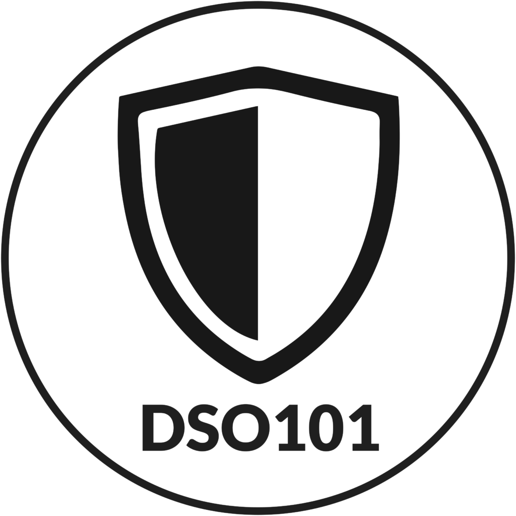
DSO101 Basic Statistics
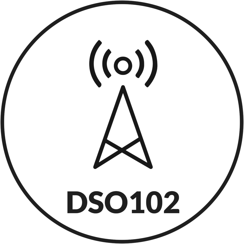
DSO102 Statistical Programming
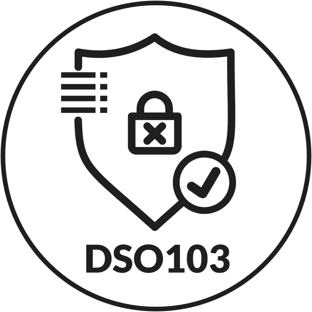
DSO103 Metrics and Data Processing
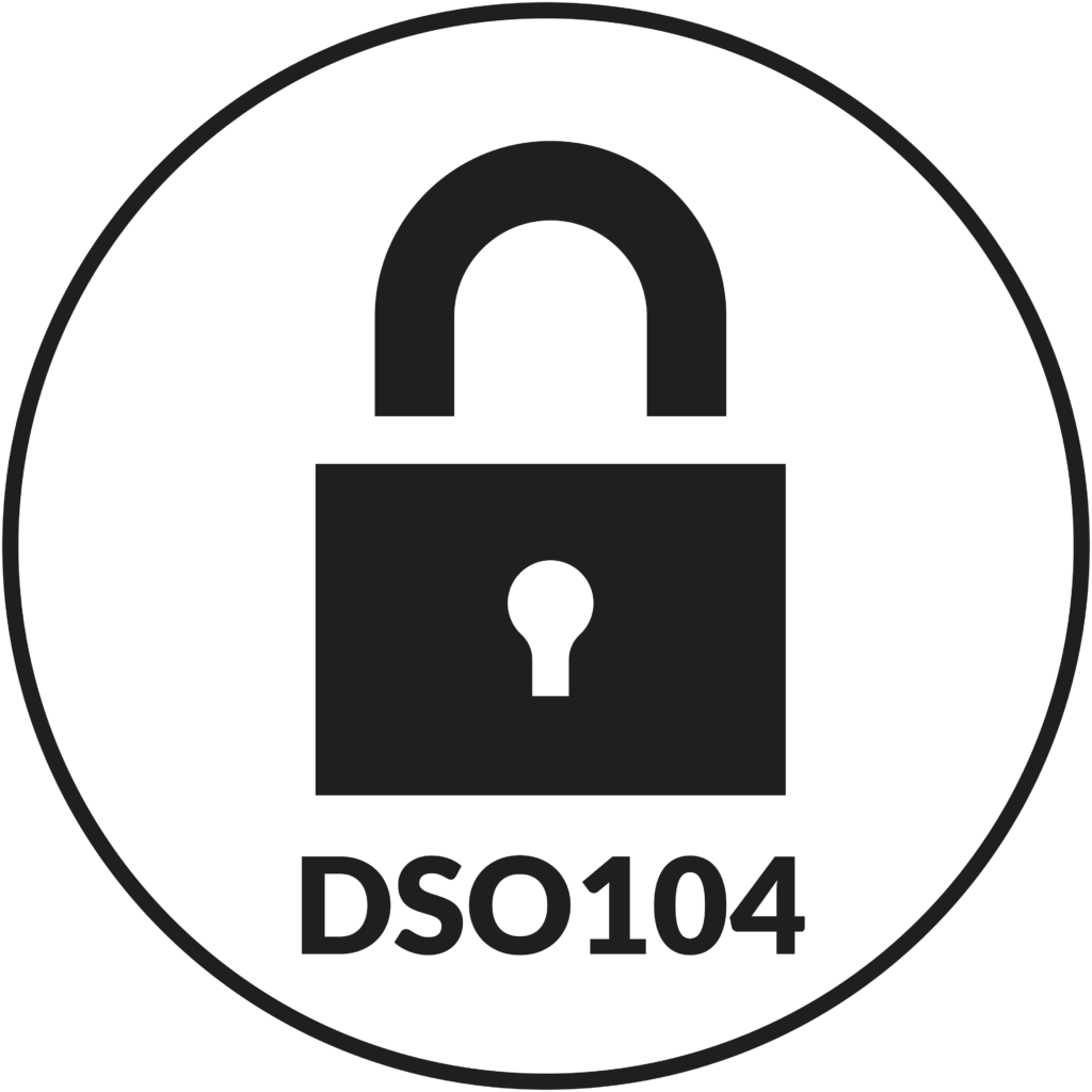
DSO104 Data Wrangling and Visualization
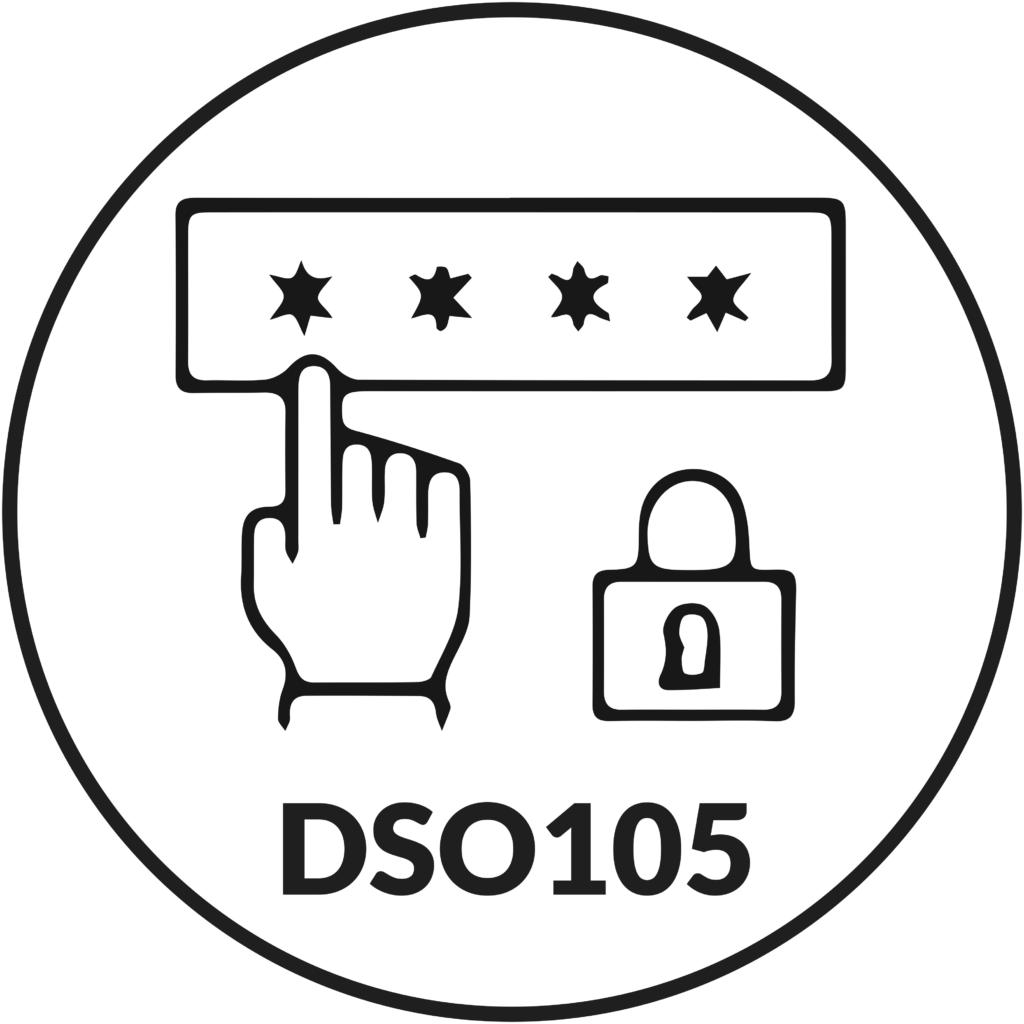
DSO105 Intermediate Statistics

DSO106 Machine Learning and Modeling

DSO107 Introduction to Big Data
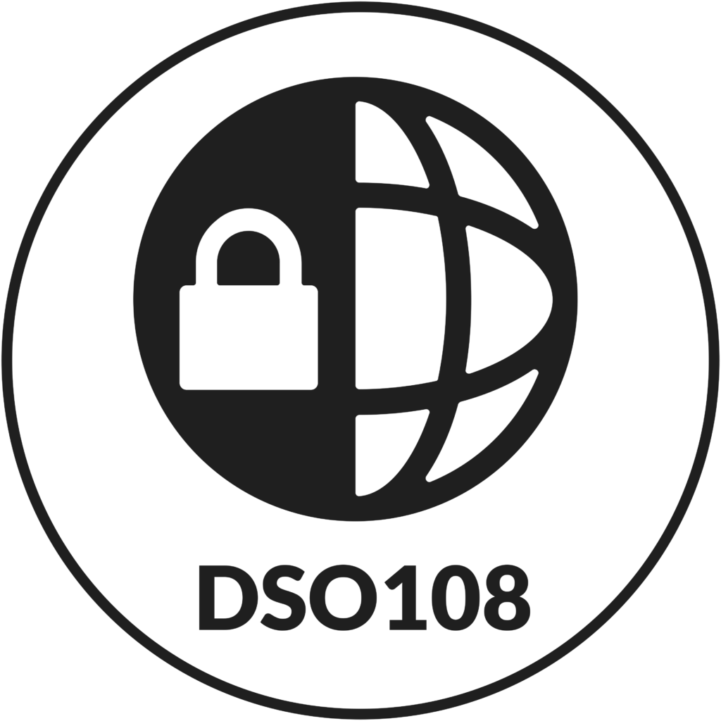
DSO108 Databases
DSO109 Programming Foundations
DSO110 Group Project
Course Descriptions
Hours: Theory 30 / Laboratory 30 / Total 60 / Quarter Credits 4.5 / Outside Hours 15 / Prerequisites: None
The Basic Statistics course will help students gain a fundamental understanding of statistical concepts used throughout the Data Science program. Topics covered include probability, data types, common distributions, common descriptive statistics, and statistical inference.
Hours: Theory 30 / Laboratory 30 / Total 60 / Quarter Credits 4.5 / Outside Hours 15 / Prerequisites: None
The Statistical Programming course teaches students how to load R and R Studio onto their PC. Students will then learn basic scripting commands and will be introduced to a vast library of functions to perform various statistical analyses.
Hours: Theory 30 / Laboratory 30 / Total 60 / Quarter Credits 4.5 / Outside Hours 15 / Prerequisites: None
The Metrics and Data Processing course will prepare students to be able to create new metrics that directly answer or monitor business questions. This module will also teach the theory and practice of statistical process control. Upon completion of this module, students will be equipped to help businesses monitor their processes and know when a process is out-of-control and needs to be fixed.
Hours: Theory 30 / Laboratory 30 / Total 60 / Quarter Credits 4.5 / Outside Hours 15 / Prerequisites: DSO101, DSO108, DSO109
The Data Visualization course is designed to help students understand that the heavy lifting in any analysis happens before the analytical procedure starts. Data wrangling is the process of changing the structure and format of raw data until the data are compatible with sometimes rigid requirements for analysis. Data wrangling also includes a quick sanity check of data quality. Data Visualization will give students an understanding and appreciation of the power in representing data graphically.
Hours: Theory 30 / Laboratory 30 / Total 60 / Quarter Credits 4.5 / Outside Hours 15 / Prerequisites: DSO101, DSO102, DSO108, DSO109
The Intermediate Statistics course is designed to teach students about hypothesis testing under multiple scenarios. Students will be able to determine which hypothesis test to utilize and be able to perform that test. Students will also learn to identify and verify the data requirements for each hypothesis test.
Hours: Theory 30 / Laboratory 30 / Total 60 / Quarter Credits 4.5 / Outside Hours 15 / Prerequisites: DSO102, DSO108, DSO109
The Machine Learning and Modeling course will introduce students to several commonly used machine learning methods. Students will learn how to determine the best methods for a given set of data, and how to use common software tools to utilize these methods.
Hours: Theory 30 / Laboratory 30 / Total 60 / Quarter Credits 4.5 / Outside Hours 15 / Prerequisites: DSO102, DSO104, DSO109
The Introduction to Big Data course introduces students to Big Data on a conceptual level and gives students exposure and practice with several skills and tools currently in use. These skills will be taught at a manageable level, and then scale up methods will be used to help students grasp the meaning and popularity of analyzing substantial amounts of data. Students will learn the foundational concepts of Big Data and will know how to move from Big Data basics to more business specific needs and requirements.
Hours: Theory 30 / Laboratory 30 / Total 60 / Quarter Credits 4.5 / Outside Hours 15 / Prerequisites: None
This course is an introduction to working with and designing databases. Students will develop a foundational knowledge of database concepts, theory, and an overview of the various implementations and architectures.
Hours: Theory 30 / Laboratory 30 / Total 60 / Quarter Credits 4.5 / Outside Hours 15 / Prerequisites: None
This course will give students programming foundations in languages utilized in the industry. This course also provides a secure foundation upon which students can build on as they progress through the program.
Hours: Theory 50 / Laboratory 110 / Total 160 / Quarter Credits 10.5 / Outside Hours 15 / Prerequisites: Final Mod
The Group Project course combines each part of the program into a group project for the student. Each student will work together as a team member for the group project, which includes daily scrum meetings to cover tasks and progress while working separately to complete them. The final group project is due at the end of the course.
HEAR FROMGRADUATES

Past students’ outcomes, starting salaries, or job prospects are not indictive of the possible job outcomes for future and current students. SCI does not guarantee employment or a starting salary upon graduation, completion, or withdrawal from SCI.
CAREER TRAINING.YOU CAN TRUST
ACCREDITED
Southern Careers Institute is Accredited by the Commission of the Council of Occupational Education.
APPROVED
Southern Careers Institute is Approved for training by The Texas Workforce Commission.
KICKSTART YOUR CAREER.
We pay for your certification within 3 months of graduating.
1. Pick your certification
2. Take the certification exam within 3 months of graduation
3. We will pay for it!
FACT: TODAY'S EMPLOYERSNEED YOUR SKILLS
Data Scientists
Occupation Code:15-2051
| Location | Mean Annual Wage |
|---|---|
| Austin | $123,530 |
| Brownsville-Harligen | N/A |
| Corpus Christi | N/A |
| Pharr | N/A |
| San Antonio North & South | $103,980 |
| Waco | N/A |
Southern Careers Institute (SCI) does not guarantee employment or a starting salary upon graduation, completion, or withdrawal from SCI. It is not required to attend SCI to attain a job or earn a certain salary in a field of employment. Past students’ outcomes, starting salaries, or job prospects are not indicative of those for future and current students.
Displayed salaries and job outlook data do not reflect the prospects of Southern Careers Institute graduates’ job placement outcomes and starting salaries. U.S. Bureau of Labor Statistics employment data, job prospects, and salary data sourced for (insert specific metro and job page) does not reflect data applicable to entry-level positions.
FINANCIAL AID. THE SIMPLE WAY.
We're here to make sure you can afford the career training you need. Our combination of grants, scholarships, loans, work-study, military, and Veteran education benefits are here to ensure a stress-free experience that works around your finances.
As an accredited post-secondary institution, SCI has various federal financial assistance programs available for qualified students enrolled in SCI programs. This does not apply to seminar students. Financial aid is available for those who qualify.
FREQUENTLY ASKEDQUESTIONS
What makes Southern Careers Institute different?
We give students an alternative to expensive, four-year degrees. Employers are looking for specific skills from candidates they can hire with confidence. Our coursework goes deeper than pen and paper, providing hands-on learning opportunities that set us apart from the competition. Our goal is to provide you with an education that will empower your future.
What if I’ve been out of school for a while?
That’s okay! At Southern Careers Institute, we have had a plethora of students successfully complete their programs after being away from school for long periods of time. We’re ready to meet you where you’re at, providing a community-based learning environment where you’ll feel right at home as you readjust to life as a student!
What can I expect to gain from Southern Careers Institute?
Southern Careers Institute provides you with the training you need to sit for certifications in your chosen field. Whether it’s our Medical Assistant training program, Medical Billing and Coding Specialist program, Pharmacy Technician program, Business Accounting Specialist program, HVAC program, or any other educational programs available, you will receive training to tackle industry-specific certifications.
I don’t know if I can afford training. Is there financial aid available?
As an accredited school, we participate in many financial aid programs and available grants to make your education more affordable. Contact us today and our financial aid officers will explain the process and answer all of your questions.
How can I obtain more information?
Click here or call 1.833.SCI.TEXAS today to speak with one of our admissions representatives, who will be happy to schedule an appointment to answer all of your questions.
Is Southern Careers Institute accredited school?
Southern Careers Institute is accredited by the Commission of the Council on Occupational Education.
Council on Occupational Education
7840 Roswell Road, Building 300,
Suite 325 Atlanta, GA 30350
(770) 396-3898 or (800) 917-2081
Does Southern Careers Institute accept credits from other schools?
If you are a student transferring from another school, you must provide a transcript and detailed course descriptions for review prior to starting school. Please be advised that the acceptance of credits from another school/state board is at the sole discretion of Southern Careers Institute.
Does Southern Careers Institute offer classes in any other language than English?
Our students must be able to read, write, speak, and understand English. At this time, programs are not offered in any language other than English.